 Colour is one of the most powerful tools in an artist’s arsenal. It evokes emotion, suggests movement, creates atmosphere, and tells stories without a single word. Whether bold and arresting or soft and subdued, colour is never accidental—it’s a language of its own. For artists across all mediums, understanding this language is not only a technical skill, but a way to connect deeply with viewers.
The Emotional Weight of Colour
Humans are hardwired to respond to colour. A warm palette—reds, oranges, and yellows—tends to energise and draw attention. These hues are often associated with passion, warmth, or danger. In contrast, cool colours—blues, greens, and purples—can calm, distance, or mystify. They’re frequently used in tranquil landscapes or melancholic portraits.
Artists use this emotional resonance to reinforce mood. Consider the difference between a stormy seascape in muted greys and blues, versus a sunlit field bathed in golden light. Both may depict nature, but each tells a different emotional story.
Symbolism and Cultural Meaning
Colours carry cultural significance as well. White, for example, represents purity in many Western cultures but is associated with mourning in others. Red might mean love or violence, power or danger. When selecting a palette, artists often draw upon these shared meanings to layer their work with symbolic undertones.
In fantasy or abstract art, where symbolism plays a strong role, these choices become even more important. A character in emerald green might subtly suggest envy, magic, or nature—depending on the surrounding elements.
Colour Harmony and Tension
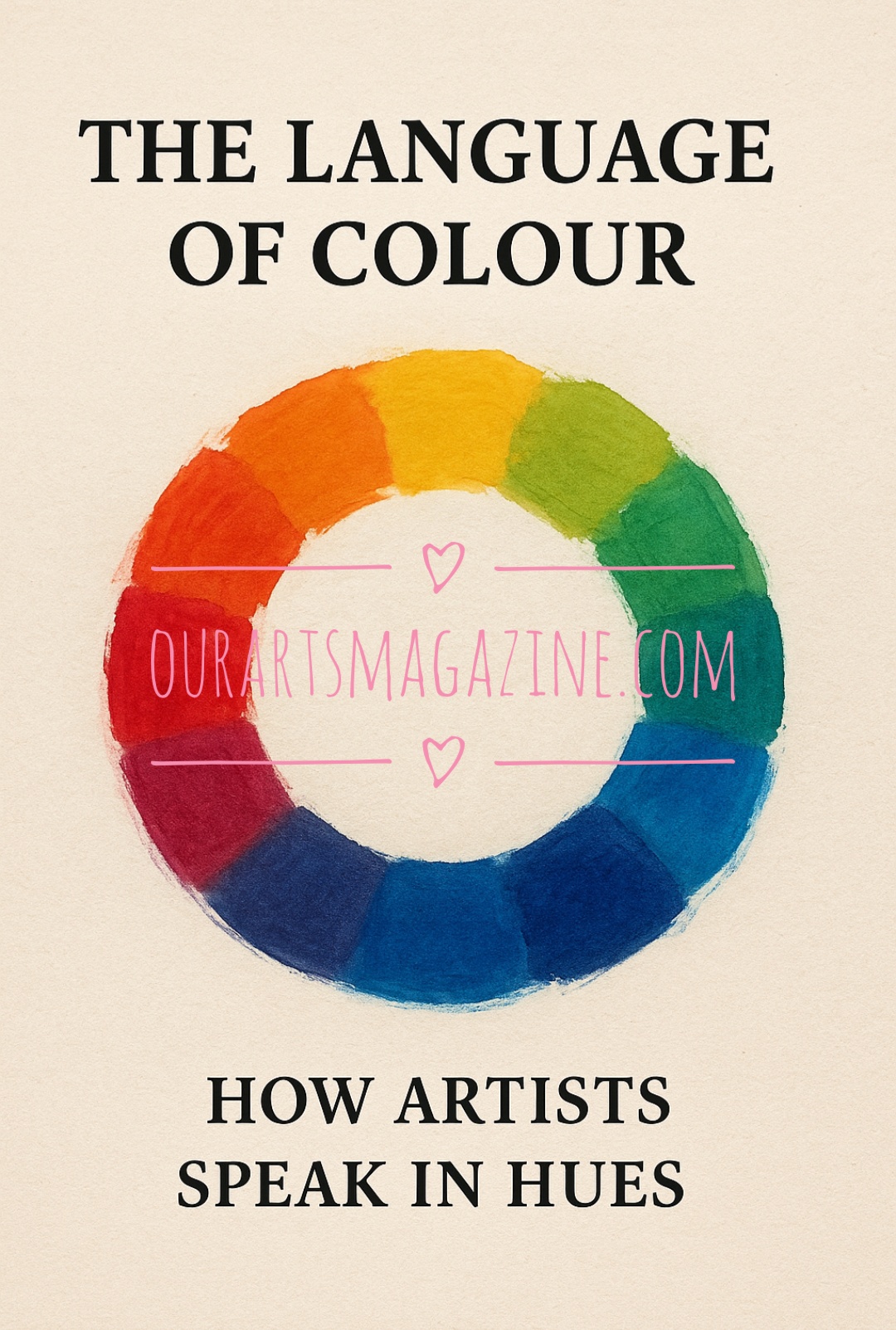
Beyond emotion and meaning lies the science of colour theory. Harmonious palettes—those based on analogous or complementary colours—tend to please the eye and unify a piece. Discordant or clashing colours can introduce tension, highlighting specific elements or creating discomfort intentionally.
Many artists experiment with limited palettes to push creativity and cohesion. A monochromatic scheme can focus attention on form and composition, while a triadic palette (using three evenly spaced colours on the colour wheel) can produce dynamic, lively results.

Colour does not exist in isolation—it is shaped by light. Understanding how light influences colour can transform a painting. Warm shadows in golden light differ vastly from the cool shadows cast in moonlight. The temperature of a scene affects not only the mood but the realism of the image.
Artists often use “colour temperature” deliberately to guide the viewer’s eye. A splash of warm light in a cool composition will immediately become a focal point.
Using Colour as a Signature
Some artists become known for their distinctive use of colour—whether it’s the pastel dreamscapes of one creator or the moody, saturated tones of another. As you develop your own work, consider how your palette choices contribute to your style. Are they consistent? Evolving? Intentional?
Colour can be your signature, your voice, and your message.
Final Thoughts
Colour is not simply a matter of aesthetics. It is emotion, symbolism, science, and instinct combined. Whether you paint traditionally, digitally, or through photography and mixed media, your understanding of colour can elevate your art from beautiful to unforgettable.
As you create, ask yourself not just what colours you’re using—but why.