Website Tips for Creatives Who Want to Be Remembered
Far too many artists treat their homepage like a digital wall: clean, quiet, and filled with beautiful images… but no words, no guidance, no conversation. And while it may look lovely, it misses the point.
Because your homepage isn’t a gallery wall. It’s a handshake. A welcome mat. A quiet but confident: “Hi, I’m so glad you’re here.”
If you’re a creative—whether an artist, photographer, maker, or writer—your homepage should do more than display. It should invite, guide, and connect. Here’s how to make sure it’s doing just that.
🧭 Guide Them Gently: Add Direction
Website visitors behave much like gallery browsers—they wander aimlessly unless gently steered. Your homepage should act like a helpful curator, guiding them toward the best bits, without making them work for it.
And let’s be honest—people don’t read websites. They scan. If your homepage doesn’t clearly show them where to go or what to do, they’ll drift away, no matter how beautiful your work is.
So let’s break it down:
📌 1. Start with a Short Welcome or Intro
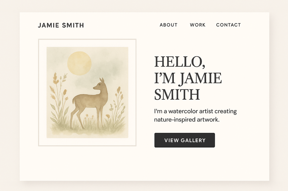
Don’t leave people wondering whose site they’ve landed on. A simple one-sentence intro at the top of your homepage gives them instant context.
Try something like:
- “Hi, I’m Jamie—a nature-inspired watercolour artist creating tranquil wildlife pieces.”
- “Welcome! I’m Tessa, a fine art photographer exploring light, solitude, and memory.”
This small touch immediately builds trust and tells visitors they’re in the right place.
👉 2. Add One or Two Clear Calls to Action
What do you want people to do next? Buy something? View a portfolio? Join your mailing list? Then you have to say it.
These are called calls to action (CTAs), and they should be short, clear, and clickable.
Examples:
- 🛒 Shop Originals
- 📷 View My Portfolio
- 📰 Read My Blog
- 📬 Join My Collector List
Don’t overwhelm people with choices. Two or three clear buttons are better than eight tiny links that get ignored.
Make sure they’re visible before someone starts scrolling—and that they work well on mobile too.
🧭 3. Keep Your Navigation Stupidly Simple
This is where a lot of creatives go wrong. We try to be clever—label things like:
- “The Journey” (instead of “About”)
- “See the Magic” (instead of “Portfolio”)
- “Happenings” (instead of “Events”)
The problem? People don’t know what that means. And if it takes more than a second to figure out what a menu item is… they won’t click at all.
Use clear, conventional terms:
- Home
- Shop
- Gallery or Portfolio
- About
- Contact
Remember, you’re not trying to impress Google with poetry. You’re helping a stranger find what they’re looking for fast.
🧑🎨 Especially for Multi-Disciplinary Creatives…
If you do more than one thing—say, you sell originals and offer commissions, or you write blogs and create art—it’s even more important to organise your site clearly.
Create separate pages for each offering, and make sure your homepage shows:
- What options are available
- Who they’re for
- Where to go to explore each
For example:
“I offer fine art prints, custom pet portraits, and tutorials for fellow artists. Choose your path below!”
Then link to:
- Shop Prints
- Commission a Portrait
- Learn With Me
Bottom line: If someone has to guess what you do, or fumble through hidden menus to figure out how to buy from you… they probably won’t.
Your homepage is not the place to be mysterious. Be clear, be kind, and lead them where they need to go—with confidence and a smile.
🖼️ Show a Little, Not Everything
It’s tempting to treat your homepage like a full portfolio—but resist the urge. Think teaser, not catalogue.
Pick 3–6 key images that:
- Represent your current style or artistic direction
- Have a strong visual impact at thumbnail size
- Each link to a different area of the site—shop, portfolio, project page
This gives your homepage a curated, intentional feel. Save the full display for your actual portfolio or shop section.
📱 Mobile Counts Too
Over half of web traffic now comes from phones and tablets. If your homepage only looks good on a wide desktop screen, you may be losing potential collectors or clients without even knowing it.
Do this quick check on your own phone:
- Can you read your welcome text easily?
- Is the main call-to-action button visible without scrolling?
- Do images resize correctly and load quickly?
🛠️ Add Personality and Presence
Creatives often shy away from showing themselves on their homepage, thinking the work should “speak for itself.” But people connect to people. A small human touch goes a long way.
Consider adding:
- A casual portrait or photo of you working
- Your voice—write how you speak. If you’re whimsical, be whimsical. If you’re serene, be serene.
- One short quote or testimonial from a buyer, reader, or collector—just enough to give social proof.
📦 Bonus Tip: Keep It Fresh
Your homepage should evolve with your creative journey. It isn’t meant to be built once and left to gather digital dust. Instead, treat it like a living part of your online presence—a space that grows, shifts, and reflects what you’re doing right now.
Try to update it:
- Seasonally – Align your homepage with the time of year. Are you offering gift-friendly pieces for autumn or winter? A summer-inspired collection? Adjust your imagery and text to match.
- When launching something new – Whether it’s a new artwork series, a workshop, a sale, or even a new blog post, your homepage should reflect that change immediately.
- After press or features – If you’ve been interviewed, exhibited, or featured in a magazine (like Our Arts Magazine!), add a note, badge, or link. This builds credibility and shows visitors that you’re active and recognised.
Even small changes can go a long way—like swapping out a featured image, updating your welcome message, or replacing your call-to-action with something more current (“View My Summer Series” instead of just “Shop Now”).
Just like a shop window, your homepage needs a refresh now and then to stay engaging. If you walked past the same high street shop every week and the window never changed, you’d assume nothing exciting was happening inside.
And the same is true online. A homepage that hasn’t changed in a year feels abandoned. A homepage that’s clearly cared for gives the impression that you’re engaged, motivated, and present.
Tip for beginners: You don’t need to rebuild the whole site. Even updating just one sentence, one photo, or one featured item each month keeps your homepage feeling dynamic and current. Schedule a monthly “homepage check-in” on your calendar to make this a habit—it takes 10 minutes and makes a big impact.
Things Artists Think Are Cool (But Actually Annoy Visitors)
Auto-Playing Music
1. It Startles or Annoys Visitors
Imagine someone browsing your site late at night, at work, or in a quiet café—and suddenly music blares.
It’s jarring, disruptive, and immediately makes people:
Mute their device
Scramble to close the tab
Decide not to return
It might seem charming to you—but to visitors, it’s often a violation of their control over their own experience.
2. It Slows Down Your Website
Auto-playing audio or video adds to your site’s loading time. And every second matters:
If your homepage is slow, many users will bounce before it loads
Mobile users (who make up over half your traffic) are especially affected
Page speed = professionalism = better rankings and trust.
3. It Breaks Accessibility Guidelines
For those with:
Hearing impairments
Sensory sensitivities
Screen readers
Auto-play audio is not just irritating—it can be inaccessible or disorienting. It’s one of the top red flags flagged by accessibility checkers and tools.
4. It Interrupts Their Existing Experience
Your visitor might:
Already be listening to their own music
Be on a call
Have multiple tabs open
Be somewhere that requires silence
Auto-play overrides their choice. That alone can be enough to drive them away.
5. It Doesn’t Add What You Think It Adds
While music can be immersive, most people aren’t on your site long enough to appreciate it the way you intended.
If it’s meant to convey mood, it’s more effective to:
Use visuals
Add a silent video background
Embed music with a clear “Play” button
Let visitors choose to hear your world. Don’t force it.
✅ A Better Option:
If music is an important part of your art, story, or brand:
Include a play button with a caption like:
“Listen to the soundtrack that inspired this series”
Embed Spotify or Soundcloud players only where relevant (e.g. in a blog post or gallery section)
Make sure it doesn’t play unless clicked
This way, your audience is invited into the experience, not pushed into it.
Black Backgrounds
Why Black Backgrounds Are Often a Bad Idea (Even for Creative)
1. Eye Strain and Readability
White or light text on a black background causes more eye fatigue, especially for older visitors or those with visual sensitivities.
Long passages of text (like bios, blog posts, or artist statements) are harder to read on dark backgrounds.
Many people scan websites — not read deeply — and black can make that harder.
2. Reduces the Impact of Art Colours
Black tends to flatten or mute colour vibrancy, especially with subtle tones like pastels, muted neutrals, or warm earthy palettes.
If your art is already dark, it can visually disappear into the background.
High-contrast pieces (like abstracts or bold colour blocking) may look too intense or harsh on black.
3. It Can Feel Unwelcoming or Overly Formal
A dark site can seem moody, cold, or high-concept — which works for some brands, but not most creatives trying to connect emotionally or warmly.
It puts a psychological distance between the viewer and the content.
4. Mobile + Accessibility Issues
Some phones and browsers don’t render black sites well, especially if accessibility features like contrast mode or dark/light switching aren’t properly set.
Without sufficient contrast or spacing, your site can become unreadable to visually impaired users — something that counts against you in both accessibility and SEO.
✅ When a Dark Website Can Work
That said, a dark background isn’t always bad — it just needs to be:
Very intentional
Paired with strong typography
Used in moderation
It can work well if:
You’re showcasing photography, especially high-contrast or night images
Your brand is bold, luxury, gothic, or editorial
You use white or bright accents to offset the darkness
You don’t rely on long blocks of text
Think of it like framing a painting: black velvet might be stunning in a gallery, but it’s overwhelming for a living room wall. A website is a living environment. People need to feel invited in — not overwhelmed or shut out.
🎨 For Artists, a Better Alternative?
Try a light neutral palette (off-white, cream, pale grey) with:
Clean white space
A soft accent colour drawn from your work
A dark charcoal text, instead of pure black on white (which is actually better for long reads)
This kind of layout still lets your art shine, but keeps the reading experience warm, legible, and professional.
🎯 Final Thought
A homepage is more than an online display case. It’s your introduction, your elevator pitch, your welcome sign—all rolled into one. Don’t let it sit empty or impersonal.
Instead, offer visitors a warm digital handshake: “This is who I am, this is what I do, and I’d love for you to stay a while.”
That’s how connections begin. And for creatives, connections are everything.
✍️ Submit a Guest Post
Not a member yet? You can still share your creative voice with our readers. We welcome guest posts from artists, writers, and creative souls of all kinds.
Submit Your ArticleShare this link with your friends if you enjoyed the post 🙂 See the share buttons below to your right