
 In the world of visual storytelling, more doesn’t always mean better. Many of the most striking artworks share a secret: restraint. Using a limited colour palette is a powerful way to deepen your artistic impact, refine your style, and communicate mood with clarity.
A limited palette doesn’t mean sacrificing expression—it means choosing with intention.
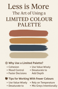
🎯 Why Use a Limited Palette?
Cohesion – Fewer colours create natural harmony, preventing your piece from feeling chaotic or disjointed.
Mood Control – A restricted palette can intensify emotion. A warm triad may evoke nostalgia, while a cool duo suggests melancholy or calm.
Faster Decisions – Reducing options helps you focus on light, form, and composition, not just colour selection.
Style Consistency – Using a recurring palette across several works can strengthen your visual identity.
Creative Challenge – Constraints force innovation. You’ll find yourself mixing unexpected tones or rethinking emphasis.
🎨 Common Limited Palette Types
Here are a few popular structures:
Monochromatic – Variations of a single hue (e.g. all blues). Excellent for mood-driven or atmospheric pieces.
Complementary – Two colours opposite on the wheel (e.g. orange and blue). High contrast, strong visual drama.
Split-Complementary – One base colour plus two adjacent to its complement. Offers contrast without harsh clashes.
Analogous – Three neighbouring hues (e.g. red, orange, yellow). Smooth transitions, ideal for calm or romantic scenes.
Zorn Palette (traditional) – White, black, yellow ochre, and red. Surprisingly versatile, often used in portraits.
You don’t have to follow these rigidly—treat them as springboards.
🧪 Tips for Working With Fewer Colours
Use Value Wisely
With fewer hues, light and dark become even more important. Test your composition in greyscale to check contrast.
Desaturate to Add Depth
Not every colour needs to be vibrant. Muted tones provide balance and make your highlights pop.
Rely on Temperature
A limited palette can still have warmth and coolness. A red can shift towards orange or purple depending on use.
Mix Greys Intentionally
Mixing complementary colours creates rich, nuanced greys—a useful trick for creating shadows and balance.
Experiment Digitally First
Digital sketching or palette testing lets you trial combinations before committing on canvas or paper.
🖼️ What to Watch For
Don’t let a limited palette become limiting. If your piece feels stuck, try adjusting value, temperature, or saturation before adding a new hue.
Be mindful of muddy colours when mixing—especially with traditional media. Keep your swatches clean.
Use your accent colour with care. One vivid element in an otherwise soft piece can command attention.
✍️ Final Thoughts
Using a limited palette is like writing a poem with fewer words—it takes skill, but what’s said resonates more clearly. It challenges you to think deeply about every stroke and swatch. In return, your art gains a richness and focus that excess can sometimes obscure.
So next time you face a blank canvas, ask: What can I say with just three colours?
You might be surprised how loud they speak.