
 Colour does not only express emotion—it shapes perception, guides the eye, and defines the essence of a piece. While instinct plays a role in choosing colours, intentional palette-building allows artists to create more cohesive, compelling, and recognisable work. Whether working digitally or traditionally, a thoughtfully constructed palette can elevate a piece from pleasant to powerful.
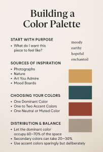
Start With Purpose
Before reaching for the colour wheel, ask yourself one simple question: What do I want this piece to feel like?
Are you aiming for drama? Serenity? Nostalgia? Perhaps you’re telling a story with a specific setting—dawn over a misty mountain, or a neon-lit alley at night. Your emotional and narrative goals will shape your colour decisions.
Write down a few descriptive words, such as moody, earthy, hopeful, enchanted. These words will act as your compass when narrowing down your palette.
Sources of Inspiration
Once you have a direction, it’s time to gather inspiration. A palette can spring from many places:
Photographs – Use images with natural lighting to extract believable, atmospheric tones.
Nature – Seasons offer readymade palettes. Autumn offers warm rusts and golds, while winter tends toward cool neutrals.
Art You Admire – Analyse colour use in artworks you love. What combinations do they use? How do they distribute light and shadow?
Mood Boards – Combine textures, colours, and scenes to refine your visual language. (See ours)
Digital artists often use eyedropper tools, while traditional artists might create small swatches or paint tests.
Choosing Your Colours
A strong palette typically includes:
One Dominant Colour – Sets the overall tone and mood.
One to Two Accent Colours – Create contrast and draw the eye.
One Neutral or Muted Colour – Grounds the piece and adds realism or space to breathe.
It’s not about quantity. A five-colour palette is often more effective than a dozen clashing shades. Limitation breeds creativity.
Consider colour relationships:
Analogous palettes (neighbouring colours on the wheel) feel harmonious.
Complementary palettes (opposite colours) create tension and vibrancy.
Split-complementary or triadic palettes allow for diversity without chaos.
Distribution & Balance
Choosing colours is only half the battle—how you use them matters just as much.
Let the dominant colour occupy 60–70% of the space.
Secondary colours can take 20–30%.
Use accent colours sparingly but deliberately—these often become focal points.
This 60-30-10 ratio is a popular design principle, but it’s flexible. Some artists reverse it for dramatic effect.
Practical Tips for Artists
Digital? Save your palettes as swatches or layers to re-use across pieces.
Traditional? Create a reference card with mixed pigment examples and dry-down results.
Value First – Test your palette in greyscale. Good value contrast matters more than hue.
Be Brave With Desaturation – Not every colour should shout. Muted colours make the bold ones shine.
Final Thoughts
A well-chosen palette is not just about beauty—it’s a strategic artistic decision. Whether you’re painting a lush forest, designing a character, or creating an abstract piece, your colours should be doing some of the storytelling for you.
Take time to explore, experiment, and refine. Let your palette serve your purpose—and speak your artistic truth.