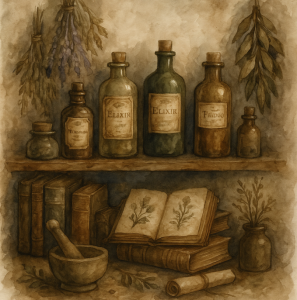


Mood Board – Antique Apothecary
Colours: Aged parchment and ivory Deep forest green and faded olive Dusty plum and dried lavender Brass, amber, and sepia tones Hints of midnight blue and rusted copper Imagery &…
Getting to Know Liesl Walsh
Capturing Serenity in Light and Lens Prints: https://liesl-walsh.pixels.com/ Education: https://www.lieslwalshphotos.com/ Portfolio for Clients: https://www.lieslwalsh.com/ Liesl Walsh is a professional fine art photographer based in Venice, Florida, known across the Gulf…
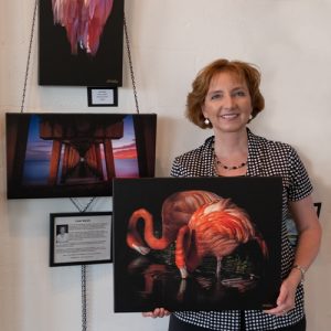
Getting To Know R Best Photography
R. Best photographs exclusively in RAW format and brings his scenes to life through editing. He primarily uses Adobe Lightroom but frequently moves between Photoshop CC, Topaz, Luminar Neo, and…
Marketing Tip: How to Write Descriptions That Sell Without Sounding Salesy
Whether you’re an artist, writer, maker, or designer, your work deserves to be seen—and understood. Yet many creatives struggle with one important task: writing a compelling description. A great description…
Using a Subdomain to Point to Your Fine Art America/Pixels Artist Website — A Beginner’s Guide
For many artists, the technical side of online promotion can feel overwhelming. But with just a little understanding, you can make your work more visible and professional — without needing…
Redefining Success: The Artist’s Quiet Revolution
Success is a slippery word. For some, it conjures visions of gallery openings and red dots. For others, it’s simply carving out an hour to create without interruption. In the…
Getting to Know Angelika Vogel
Through Art, Across Oceans https://angelika-vogel.pixels.com For Angelika Vogel, creativity has always been part of life’s rhythm. Based in Berlin, she began her career not behind the camera but in the…
Building a Recognisable Creative Brand: A Long-Term Strategy for Artists, Writers & Makers
In a world where creativity thrives across platforms, standing out is not just about talent—it’s about clarity. Your brand is not your logo or your font. It’s the emotional and…
Mood Board – Picnic in the Countryside
Colours: Cherry red and buttercup yellow Sky blue and soft green Gingham white, beige, and soft neutrals Touches of floral pinks and fresh berry hues Imagery & Visuals: Wicker picnic…
Less is More: The Art of Using a Limited Colour Palette
In the world of visual storytelling, more doesn’t always mean better. Many of the most striking artworks share a secret: restraint. Using a limited colour palette is a powerful way…
Building a Colour Palette: From Inspiration to Impact
Colour does not only express emotion—it shapes perception, guides the eye, and defines the essence of a piece. While instinct plays a role in choosing colours, intentional palette-building allows artists…
Getting To Know Hugh Warren
Through the Lens with Hugh Warren: A Quiet Geometry of the World https://1-hugh-warren.pixels.com Hugh Warren didn’t follow the usual path into photography. Growing up in rural Western Australia, his early…
The Language of Colour: How Artists Speak in Hues
Colour is one of the most powerful tools in an artist’s arsenal. It evokes emotion, suggests movement, creates atmosphere, and tells stories without a single word. Whether bold and arresting…
Mood Board – Celestial Dreams
Colours: Midnight blue and deep indigo Silver and soft gold accents Lavender, dusky rose, and twilight greys Starry white and moonlit pearl Imagery & Visuals: Star maps and constellations Crescent…
Let’s Talk Cropping
One of the most common reasons we have to decline printing requests on Fine Art America is poor cropping. It’s a small detail, but it can make or break your…

