Why every photographer should watch Bob Ross
Before I explain why I think that every photographer should watch Bob Ross, I have to let you in on a little secret. For the most part, I stopped reading photography “how to” books and magazines. There are some exceptions like Ansel Adams book series “The Camera”, “The Negative”, and “The Print” and some other books like that. To my defense though, those books are very specialized, very technical, and not exactly for the faint of heart. I also watched a 3 hour very technical workshop on YouTube by Fred Picker from Zone VI. That would have been torture for most people, but I watched it twice! If that is not dedication, I don’t know what is. Besides learning about some technical aspects of the craft that were fairly new to me, or I simply forgot, I have been learning about other photographers, painters, and art in general. Especially modern art and 20th century photography. As it turned out, the 20th century was an exciting time for all forms of art. More recently, I started to watch Bob Ross’s “The Joy of Painting” reruns and “The Best of the Joy of Painting” on public television and I found out that many of the things I learned about composition by studying other artists, Bob Ross applied in less than 30 minutes in 403 episodes. Yes, that’s how many episodes there are of “The Joy of Painting”!
I thought that you might be interested if I share what I have learned from all this so far. Maybe it will inspire you to do what I did, and still do, and probably will keep doing until I fall apart. If you are anything like me, you just might start looking at your art with refreshed eyes. It does not necessarily make you better at what you do, although there is a good chance it will, but that is not the point. The left and right side of your brain are not in competition. It might make the whole process more enjoyable and understandable though, and that should count for something.

https://fineartamerica.com/featured/everglades-lake-041901-rudy-umans.html
Ever since the utilization of photography for commercial purposes, painters and photographers always kept an eye out on each other. The daily bread for painters was in portraits. Especially in the western world. In the oriental world not so much. They were more into nature and zen type of things. For western painters though the rent was paid from painting portraits. When photography showed up in the first half of the 19th century, it took a little bit before it was taken seriously and photographic techniques and processes were developed that could actually be used in a relatively easy and cost effective way. When these photographic techniques and processes became available, one of the first uses was portraits. Photographers started to make portraits. This was a major threat for professional portrait painters, like most painters were at the time, and the result was that painters started to create more realistic portraits to compete with photography. At least, that was the goal. Even hyper-realistic portraits.
Later, photographers were longing for a recognition of photography as an art form, hence Pictorialism was born to mimic paintings. The recognition they were longing for didn’t really happen during the pictorialism era and most photographers became bored with it in the late 1920ies and early 1930ies. Modern art became popular (for a great deal thanks to two photographers, Alfred Stieglitz and Edward Steichen nonetheless) in the United States and the result was that pictorialism was out and “straight” or “pure” photography was in, all of a sudden. Even though it was already practiced in the late 19th century and early 20th century by the French photographer Eugene Atget, who is called “The father of modern photography”. It wasn’t until the arrival of modern art in America that the labels ‘straight” and “pure” were created and it became a movement of some sort. The start of Modern Art was also the start for the path of recognition in the art world for photography, and the “Golden Era” for photography began.
It seems that the rivalry between the two art forms lingered on, even today. Maybe not so to the extreme as in the early days and definitely a lot friendlier, but it seems that it never completely went away either. Not really. It is almost like Coke vs Pepsi, Chevy vs Ford, Kellogg vs Post. Etc. Yes, I said almost.
People seem to like to choose sides, but guess what, it is okay to like both Coke and Pepsi, that you drive a Ford and your spouse a Chevy and that Kellogg and Post cereal boxes are sitting peacefully next to each other in your kitchen cabinet. It is okay to like painting and photography. Heck, it is definitely okay to like all art!
I love painting. As far as photography is concerned, I understand nothing. – Henri Cartier-Bresson (world famous street photographer)
To me it seems a good thing that photographers study painters and paintings and vice versa. Picasso had several photographers among his best friends and there was a mutual appreciation. Paul Strand, as another example, was known to study Cezanne, whose influences are apparent in Strand’s studio and landscape work for instance. It has been said that he once went on a trip through Europe just to see every Piero de la Francesca painting he could find. (1)
These are just two examples. There are many, and I don’t see any reason why the rest of us can’t do the same. After all, photographers and painters have a lot in common. Even on the technical side of things, painting and photography have at least one common field, a common interest, a common technique, if you like.
The technique is called “Flat Depth Painting”. I am sure that many, if not most, accomplished painters are very familiar with the technique, and I am also sure that many photographers are familiar with at least some of the tools used to accomplish this “Flat Depth Painting”. This article however was written for photographers who are not all that familiar with those tools or are familiar with some, but not all, or for photographers who would like a refresher. Sometimes we get so stuck in what we are doing that all we remember is that very thing we are stuck in without realizing it. Hopefully this article will help you getting “unstuck”. Heck, there might even be a painter or two who enjoys this little write-up.
As the name suggest “flat depth painting’ is a technique used to create the illusion of depth on a two dimensional surface. “Illusion of depth “is a phrase Bob Ross said a lot and for good reasons. The painter starts with a blank canvas and creates whatever and however he or she wants. The photographer starts with something that is already in front of him or her, a three dimensional scene that needs to be made two dimensional without loosing any of that what attracted us to the scene in the first place. Painters have this hundreds of years old technique that can help with that. Most techniques discussed here were fully developed during the Renaissance era in the 15th and 16th century. During the same period, the predecessor of the photo camera, the portable camera obscura, became popular with plein-air painters. Coincidence? (2) Even though attempts were made, they didn’t worry about it a whole lot during the preceding medieval times.
“In my view, photography and painting really share on history. The influences that work on one, work on the other” – Jack Welpott (Well-known 20th century photographer)

https://fineartamerica.com/featured/midtown-miami-rudy-umans.html
Photography is the Art of Seeing and the “flat depth painting” technique tools can help with that. Let’s find out what some of those tools are to create this “Illusion of depth”!
Layers.
Pretty much any scene and subject are made up of layers. Layers are like different planes. There can be a row of trees or houses, or whatever, and 20 feet behind that, another row of something, or just one object. All these different planes are layers. Think of the scene in front of you as a giant pop-up book. (Remember those?) In a pop-up book, the layers are clearly visible and if you look at the pop-up pages at eye level, you can see the 3D feel and depth. The same as the layers in the real world. They contribute greatly to the illusion of distance and depth. Especially if these layers overlap. You know, an object on the left, then on the right, in the middle, one layer/object partially obscuring the layer/object behind it, and so forth.
Layers alone are not enough though. If those objects are of the same tonal value, meaning they are similar in contrast, the illusion of distance will get lost. Contrast is one of the most important aspects of the quality of a photograph. Did you ever notice that Bob Ross always put in a white water line at the water’s edge and dark rocks right next to it on the shore? This was to create the contrast needed to separate the water from the land. Especially when the reflection of his trees, and what have you, blurs this separation. If there is not enough contrast or separation of the different layers, the image will look flat, and the opposite of the illusion of depth and distance is created. Not what we want. Painters might be able to fix this on the go. Photographers might have that opportunity to fix that in post processing, as we will see later on.
Scale Shift
Technically it is called “Scale Shift”, but I prefer the equally technical term “In your face”. Objects appear to be smaller the further away they are. Smaller, more distant objects, are also less detailed. This phenomenon gives us a sense for scale and distance. So, how can we accomplish this sense of distance and scale? One way is to have a large object in the foreground. Bob Ross called it the “Bravery Test”. I call it the “In your Face” approach. He had the habit to put a huge tree right in front and he did that to give the painting a sense of scale. Big objects in front, little ones in the back. This big object does not have to be the focal point. It can serve as an element that can lead the viewer to the focal point. In an interior for instance, you can have a large couch in the foreground with a fireplace on the other side of the room. This fireplace would be the focal point and the couch might give the viewer an idea of the size of the room or the fireplace. Besides the sense of scale, this technique can also give a sense of intimacy. Almost like the viewer becomes part of the scene. As if the viewer is actually there and in person.
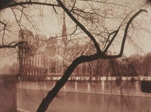
Eugene Atget 1925 (3)
This image caught my attention a long time age, but at the time I didn’t know who the photographer was and why I liked the image. Now I know both and it changed the way I see!
Aerial or Atmospheric Perspective
As a rule of thumb, darker shades and colors go in the foreground and lighter shades and colors go in the background. Bob Ross always painted his “Bravery Tests” trees very dark and trees in the background very light. Bold colors or darker shades in the foreground and lighter, less contrasty colors and shades in the background will give the illusion of depth. Now, in photography dark objects in the front are not always possible. Sometimes these potential candidates for the bravery test are just not dark. Sometimes they are even white. It is amazing how much light is reflected by concrete, painted surfaces, and even tree trunks for instance. If that is the case, don’t worry. As long as there is enough contrast between that object and that what is directly behind it, you will be okay. These challenges are a beautiful thing for photographers.
Photographers can manipulate the aerial perspective with the aperture setting. A large aperture with a shallow depth of field can separate the foreground from the background by making the background blurry. However, if the image is focused on the foreground and a large aperture is used that makes everything but the subject blurry with no detail and basically unrecognizable, the illusion of depth and distance will be lost. The subject just hangs in there in space, which is sometimes good and appropriate and sometimes it is not. It is obviously up to the photographer then to decide to what degree distance details should be still visible to maintain that illusion of distance and depth. In other words, use your aperture settings (f/stops) wisely!
One thing Bob Ross almost always did is vignetting. When he painted a sky, he made the corners a little darker. Not so much that it became obvious, but enough to influence how the painting was/is viewed. It draws the eye in. It’s like your brain tells you to get away from those darker corners and follow the light because our brains are more geared towards the light than the dark. A good example of that are little pieces of debris or dirt on your image. A light and bright little piece of debris or something is noticed way before a dark one.
Spacial Increments
In addition to what happens with scale shift where objects appear to become smaller the further away they are, the distance between these objects also appears smaller. I reckon that this is common knowledge, but I thought I should mention it anyway because it is part of this whole depth perception exercise and painters take advantage of this phenomenon with the Flat Depth Painting technique. If they can, photographers can!
Photographers can manipulate this illusion with their choice of the focal length of their lens. As we know, a telephoto lens gives the illusion of compression and a wide angle lens gives the illusion of expansion, With the choice of the focal length, you can determine how the spacial increments are perceived.
Although the aperture doesn’t really affect the spacial increments, a shallow Depth of Field can give the impression that it does. So, the combination of focal length and aperture opens up a number of creative possibilities for photographers pertaining to spatial increments.
Linear Perspective
Linear perspective is something everybody is familiar with. It is one of the oldest perspective techniques used in art and goes back a few thousand years. If people talk about perspective, this linear perspective is what they usually talk about. It was first used in architecture, and is basically converging lines of buildings, roads etc. I don’t think we need to spend a lot of time on this. For the most part. it can’t be manipulated in photography. Not when you take the image and not in post processing. The only thing a painter and a photographer can do is to elevate their vantage point. The perception of a linear perspective will change with a higher vantage point. I believe it was Thomas Moran, the famous 19th century western painter, who had huge scaffolds built in order to change the (linear) perspective with a higher vantage point. (4). Ansel Adams had a special platform on top of his station wagon for the same purpose.
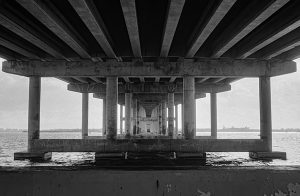
https://fineartamerica.com/featured/william-m-powell-bridge-miami-1-rudy-umans.html
This is pretty much all I can think of as far as the overlap goes between painting and photography pertaining to “Flat Depth Painting”. Obviously, they all have something to do with composition. There are some other aspects of “Flat Depth painting” that I did not mention, such as a thing called Isometric Perspective, which is basically certain objects in the painting appear to be somewhat tilted. I am not sure how to accomplish this in photography. For a while, it was in fashion to tilt the image. That was called a “Dutch Angle”. It came from the movie industry and found its way into photography. It was a fad, and we are all glad it is over. (at least I am)
Even though the tittle of this article might imply that the Flat Painting Technique mainly applies to landscapes, it can, and is, applied to many other disciplines of painting and photography as well. Vermeer used it with his interior scenes. It even applied to portraits. Remember the importance of the focal length of your lens with portraits. It can make or break a good portrait.
What else can there be? Technically speaking. Photographers don’t really worry about types of paints, paint brushes and all the other goodies that painters love. It doesn’t apply to photography and neither does focal length, aperture, shutter speed, etc, for paintings.
“The painter constructs, the photographer discloses”. – Susan Sontag
As mentioned, a painter starts with a blank canvas on which the painter can create whatever the painter likes. “The canvas is your world where you can do whatever you want” was one of Bob Ross’s catch phrases.
Photographers don’t have that luxury. Photographers don’t have a world of their own where they can do whatever they want. Photographers have to deal with a world that is already there, and it is the photographer’s job to get the most out of that world. They can’t move a tree because it looks better on the other side, chop off the top of a skyscraper because it is just al little bit too high, or make a pond bigger or smaller with more lush greenery just because it would look better. No such luck.
We, photographers, will have to look for the aspects and tricks used for flat depth painting and other tricks used in Photogrpahy. We will have to go out and see if we can find something that will work. Hopefully some of these painting techniques will help with that. We know what we are looking for and now we know why.
So, what do we do if we took a picture, and everything looked great in real life at the scene? We also actually remembered some of the things in this article, checked all our settings and it looked like we had all our ducks in a row, but when we came home and looked at the capture on a computer screen, the image looked flat, muddy, and gray no matter how hard we tried? Do we cry a little and move on or is there something we might be able to do?
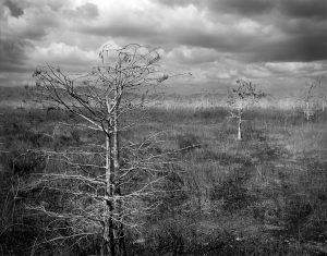
https://fineartamerica.com/featured/1-everglades-florida-pond-cypress-trees-4-rudy-umans.html
Yes, there is!
If the image looks flat and uninteresting, we can use the Dodge and Burn Tools and the Curve Tool in photoshop (any program, really) to improve on this boring picture.
For people who read this and are not familiar with dodging and burning or the curve tool, Dodging and Burning are the premier tools to use to create contrast. (Let’s call it d&b. The full name Dodging and Burning is a lot of typing). Dodging makes things lighter, burning makes things darker. The curve tool, like d&b, also adjusts contrast, but it is done more globally, and you can adjust the d&b per RGB channel. Photoshop puts the curve tool on a separate layer and therefore adjustments can be made non-destructively, which makes it easy to make corrections or start over if the first try didn’t work out.
D&b is done more locally on the image. You pick and choose what area you want to work on Normally d&b is done on a regular layer, meaning it is not non-destructive and corrections etc. are not easily made. However, there is a way to make d&b adjustments non-destructively. D&b can be done on a new fill layer at medium gray. Medium gray, you ask. If I put a medium gray layer on top of the layer that needs to be adjusted, I can’t see that underlying layer anymore. Well, this what you do, go to layer in the toolbar on the top of your screen and click on Layer and New Layer. This gives you a pop-up screen. In the “mode” drop down field, you choose “Soft Light”. That gives you the option to create a soft light 50% gray layer. The Soft Light mode makes the gray transparent. The d&b is done on that 50% gray layer. An additional advantage of using this method is that it does not change the tone, like d&b does sometimes. It just changes to brightness.
Particularly the curve tool has more settings that are very useful to control contrast but explaining those in depth goes beyond the scope of this article. There are some excellent YouTube videos about the curve tool and d&b. If you are not familiar with these tools or the gray layer technique, I recommend checking out those videos. These three tools are some of the most important adjustment tools in Photoshop. If you only have time to learn one adjustment tool in Photoshop, it should be the curve tool in my opinion with d&b right behind that. No need for fancy pre-sets.
Anyway, what you can do to separate the layers in your image is to burn (darken) the edges of one layer and dodge (lighten) the adjacent or overlapping layer. You do this all over the image (carefully!) and the flat layers, will begin to separate, so to speak, in most cases. Spend some time practicing, and you will see a difference.
Although these tools can used for both black and white and color images, color images have the additional advantage that, besides tone, you can also control the contrast with color. You can change the vibrancy and saturation of individual colors to create a greater separation. Although, saturation must be applied with great caution. Especially saturation, it is very easy to overdo it.
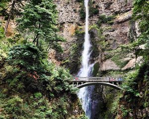
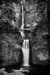
https://fineartamerica.com/featured/multnomah-falls-rudy-umans.html
https://fineartamerica.com/featured/multnomah-falls-5860bw-rudy-umans.html
Multnomah waterfalls. These images were as flat as a doornail, but with the curve tool and by selective local dodging and burning I was able to create depth in this image. (Both in this B/W version and in the color version)
Do I still have to watch Bob Ross after reading this?
No, but I recommend it. From all the TV painting teachers I have seen, and I have seen a few, Bob Ross is clearly a master of this technique and a true master of his art. He had the ability to explain depth perception, sense of scale and distance and all that in an easy going and fun way. In the meantime, he was a very serious painter and every brush stroke, every color, and every drop of gesso was put on his canvas very deliberately and purposefully. Nothing that Bob Ross painted on his canvasses was by accident, let alone a “Happy Accident”. It may have looked like it was all done very casually, but it was not. He also used the same techniques in virtually all 403 episodes. Missing an episode is no big deal.
Besides Bob Ross, there is at least one other famous painter I think, which is worth studying by photographers (and painters for that matter) and that is Paul Cezanne.
The general consensus in the art world is that modern art really started with the post-impressionist Paul Cezanne. He is the one who is regarded as “The father of modern art”. Even Picasso said that “Cezanne is the father of all of us”! Why is that?
Paul Cezanne started to think in 3 dimensions. For instance, instead of reminding us that the basic shapes are a triangle, a rectangle, and a circle, he stated that the basic shapes are: The Cone, the Cylinder, and The Sphere. The 3 fundamental forms he called them. He was also a so called “Ex-Nihilo” meaning “Out of Nothing” This means that his style was not based or influenced by previous styles and artists. It was a brand new thing coming solely from his mind and nothing else.
It doesn’t sound like much, but it is very significant. Many modern art movements after this, such as Fauvism (Matisse) and Cubism (Picasso) are heavily influenced by Paul Cezanne’s way of three dimensional spatial thinking on a flat surface.
As I already mentioned in the beginning of this article, Paul Strand studied Paul Cezanne as much as he could. .(1) You can see the influence in Paul Strand’s landscapes and Cezanne’s 3D and “Cone, Cylinder, and Sphere” concepts are obvious in Paul Strand’s studio work such as his cups and saucers series. In turn, Ansel Adams’s was very heavily influenced by, you guessed it, Paul Strand. Especially Strand’s New Mexico images. It was these images that made Ansel Adams decide to become a professional photographer in 1930 instead of a professional pianist.
Art Painting and photography are most definitely connected!
Besides the “Flat Depth Painting” technique, I recommend studying all paintings and photographs you like. Study them for use of negative space, balance, order in chaos, use of shadows and forms, etc., and try to figure out why you like what you like. What is so good about the painting or Photograph?
So, I hope all this was a little helpful. Some of you might think all this was old news and it probably was, but I hope it wasn’t old news for every photographer or old enough for the others. Even if you are familiar with some, or all of these techniques, a reminder never hurts I suppose. That’s the beauty of our art, learning is a never ending story.
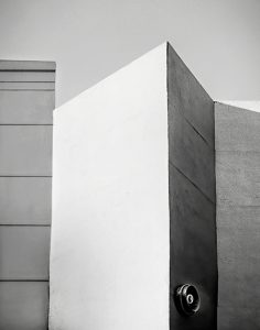
https://fineartamerica.com/featured/building-detail-miami-071901-rudy-umans.html
This is the third installment of my series of blog posts about the different aspects of photography. Future episodes will be about “Large Format Photography”, “What’s in the Bag”, “Projects”, “If it is not printed, it is not a photograph”, and “My favorite photographers”. The order of these might change. If you have a subject you would like me to write about, please let me know in the comments.
All the images in this article, and many others, are for sale. Just click on the links.
Visit my Fine Art America/Pixels gallery here: https://rudy-umans.pixels.com/index.html?logout=true&md5=true
Every reader of this blog receives a 10% discount until the end of May 2023. Just use code: HZURBU at the check-out
If you haven’t done so, please read my previous articles here: https://ourartsmagazine.com/blog/2023/03/18/about-photography/ and here: https://ourartsmagazine.com/blog/2023/01/22/what-is-pinhole-photogrpaphy/
Rudy Umans
Monday, April 25, 2023
Notes:
- Fred Picker-“ZONE VI Newsletter 22 September 1979”
- See my article about pinhole photography. https://ourartsmagazine.com/blog/2023/01/22/what-is-pinhole-photogrpaphy/
- Eugene Arget (pronounced Ar-Jet. The A as in Awesome) French Photographer 1857-1927
- The Rich Wild West of American Art | (A Waldemar Januszczak Documentary)
Some disclaimers.
This is written about the more serious art by artists who invest in their passion either by time, devotion, money, or all the above. None of it is related to the quality of their art or appreciation by others. That’s irrelevant. Artists and Photographers are the same thing.
Also, the above are strictly my personal opinions and/or experiences.
All images and text, with the exception as noted, are created by the author of this article and enjoy copyright protection as defined by the laws of the United States and the rules of the World Intellectual Property Organization (WIPO) of which the United States is a member.
This essay was 100% written by me. No Artificial Intelligence was used. That includes all the typos and grammar mistakes that only humans are allowed to make.
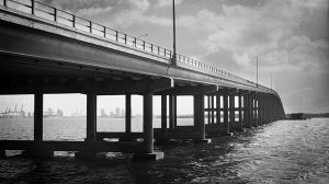
https://fineartamerica.com/featured/william-m-powell-bridge-miami-rudy-umans.html

Your post is truly remarkable and insightful! As a photographer, your perspective on art and the way you appreciate the works of influential artists such as Bob Ross is truly unique. Bob Ross’s work has heavily influenced many artists and his contribution to the world of art is undeniable.
You also mentioned Cezanne, who is often regarded as the father of modern art. Cezanne was a French artist who lived from 1839 to 1906, and his art played a crucial role in shaping the artistic movements of the 20th century. His work is characterised by his use of bold colours, expressive brushstrokes, and the exploration of new perspectives in painting.
Cezanne’s work was highly influential in the development of modern art, and his use of geometric shapes and colours laid the groundwork for many future artistic movements such as cubism, fauvism, and abstract expressionism. His art was also known for its focus on capturing the essence of his subjects, rather than just depicting their physical appearance.
As someone who is mostly self-taught or guided by online tutorials, it’s important to recognize the importance of learning from the experiences of those who have paved the way for us. Exploring the works of influential artists like Cezanne can be an excellent way to learn new techniques and to expand our creative horizons.
Well done, Rudy!
Wow! You make me blush! Thank you very much for your kind words! And very happy you like Cezanne! Thank you for the additional information about this great painter!
Great insight. The kind of insight that comes with many years of practice
Thank you very much Fernando!
The version of that Sontag quote I heard was to the effect that photography, in the traditional sense, is an *analytical* art, whereas Bob Ross et al are doing synthetic art — in the sense of creating from nothing, that blank canvas thing.
I’d also note that Cezanne and others of his era (Monet comes immediately to mind) were making use of the entirely new and more color saturated pigments that chemists first came up with in the mid-19th century. If they’d been born fifty years earlier…
The post is mainly about composition that can apply to both branches of art. Very happy though you too pays attention to painters.
Indeed we photographers can learn much from painters. You bring up a number of characteristics that we tend to not ever think about, such as scale shift, layers, atmospheric perspective. Those come with the view and we normally don’t realize that with care we can take advantage of these features.
It has fascinated me for a long time how painters handle perspective quite differently from the way a camera does. That topic we might discuss at some other time. For now thanks for bringing us to the “joy of photography”.
Thank you Ludwig! That is very kind!